Inhaltsverzeichnis
Study results (2021-03-10)
Tagged as: blog, study results, analysis results
Group: G_20/21
Presentation of the results of the sentiment analyses, content analyses and network analyses
After performing the analyses, we received the following results.
Sentiment Analysis
To extract the emotional information of a tweet, we performed a sentiment analysis. The Python TextBlob DE lexicon-based approach was used for this purpose. The automatic sentiment analysis was performed on all self-authored COVID tweets and non-COVID tweets from politicians.
In addition to the automatic sentiment analysis, two other qualitative analyses were performed, sentiment and emotion analysis. The dataset consisted of each 120 viral COVID- and non-COVID-tweets. Each tweet was assigned a polarity (positive, neutral or negative) and a category of emotions. In detail, we focus on the emotions anger, anticipation, disgust, fear, joy, sadness, surprise and trust according to Plutchik (Plutchik, R. (1980). A general psychoevolutionary theory of emotion. In Theories of emotion (pp. 3-33). Academic press.).
Automatic Sentiment Detection
Of all 44,312 COVID-tweets, 17,761 (40.1%) were classified as positive and 8,688 were classified as negative (19.6%). 71,257 (33.18%) of the 210,511 non-COVID-tweets were classified as positive and 32,151 tweets as negative (15.3%). The average sentiment of each party is almost identical when comparing COVID-tweets and non-COVID-tweets. The highest sentiment on average is found for CSU and SPD (COVID-tweets: both 0.13 (positive), non-COVID-tweets: both 0.12 (positive)) and the lowest AfD (COVID-tweets: 0.04 (positive), non-COVID-tweets: 0.04 (positive)).
The course of the polarity over the entire year shows a minimum of -0.029 (negative) and a maximum of 0.34 (positive) of the COVID-tweets. The average is 0.083 (positive). The large fluctuations of the polarity in the first quarter are probably due to the small amount of data. The minimum and maximum values of the non-COVID-tweets over the entire year are 0.051 (positive) and 0.125 (positive), the average is 0.093 (positive).
Qualitative Sentiment and Emotion Analysis of Viral Tweets
The results of the qualitative Sentiment Analysis were: Of the total of 120 viral COVID-tweets, 77 (64.2%) were classified as negative. The proportion of negative tweets is also highest with viral non-COVID-tweets at 88 (73.3%). The independent members (15 tweets), AfD (14 tweets) and Die Linke (13 tweets) largely contribute to these COVID-tweets with negative polarity. For the non-COVID-tweets the AfD and Die Linke with 14 tweets each and the independent members with 13 tweets.
Whereas the qualitative emotion analysis showed: Among the independent members, 13 of the 15 COVID-tweets were assigned to the category anger. The second largest share of COVID-tweets with the category anger is attributed to the AfD (40.0%), the remaining tweets are assigned to disgust (8 tweets) and anticipation (1 tweet). Overall the three most common categories are: anger (28.3%, 34tweets), disgust(23.3%, 28 tweets) and trust (15%, 18 tweets). The three most common categories of all non-COVID-tweets are anger (41.6%, 50 tweets), disgust (21.6%, 26 tweets) and trust (15%, 18 tweets). The Distribution of COVID-tweets by party to the categories is shown in the figure below.
The AfD (11 tweets) and independent members (10 tweets) have the highest proportion of non-COVID-tweets in the anger category. The party Die Linke has the largest share of non-COVID-tweets with the category disgust with 10 tweets. The emotion analysis in comparison between COVID-tweets and non-COVID-tweets shows that the biggest differences are in the categories anger (34 COVID-tweets, 50 non-COVID-tweets), fear (11 COVID-tweets, 3 non-COVID-tweets) and anticipation (15 COVID-tweets, 6 non-COVID-tweets).
Content Analysis
We decided to perform a content analysis for all tweets through the concept of topic modeling with Latent Dirichlet allocation (LDA) and a qualitative content analysis of the most viral tweets with manual annotation into categories.
Topic detection with LDA topic modeling
We decided to divide the dataset into the four quarters of the year because the course of the pandemic can be broken down into these. The first quarter was dominated by the emergence of the virus in Europe and Germany, followed by the very high infection numbers in the second period, the continuously low case numbers in summer and the rapidly increasing case numbers combined with the second lockdown in the last quarter.
In the first quarter all distinct topics were COVID related besides the Prime Minister election in Thuringia. In view of the high case numbers and the high proportion of COVID-tweets in March, this is not surprisingly. The second quarter was dominated by parliamentary COVID debates, school closures and the crisis in all. The U.S. president Trump and racism were also dominant in this period. In the third quarter the topics were less dominated by the pandemic. The refugee disaster in Moria and the debate regarding the German police were paramount. Nevertheless the German parliament and the school closures were key topics also in this quarter. The end of the year was dominated by the measures of the German parliament, such as exit restrictions and lockdowns. In this context democracy and the restriction of liberty rights were discussed extensively. The elections in the U.S. were the only non-COVID related main topic from October till December. All in all there are some topics standing out between pervasive COVID-related topics.
Qualitative content analysis of viral COVID-tweets
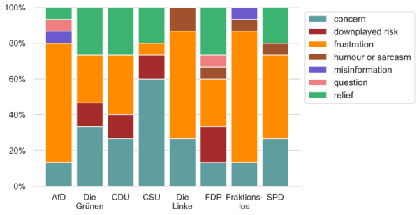
For the annotation of the most viral tweets we took the categories from the scientific work of Chew and Eysenbach: Humour or Sarcasm, Relief, Downplayed Risk, Concern, Frustration, Misinformation and Question (Chew, C., & Eysenbach, G. (2010). Pandemics in the age of Twitter: content analysis of Tweets during the 2009 H1N1 outbreak. PloS one, 5(11), e14118.). The distribution of the content categories per party can be seen in the chart:
Network Analysis
To explore the connections between the different accounts in our dataset, we decided to use methods from the context of Social Network Analysis (SNA). Since we are dealing with accounts from a social media platform (Twitter), a plausible way to represent the accounts and their connections is as a network. These networks are built on the basis of graphs, mathematical models connecting nodes (accounts) through edges (Twitter-inherent connections and interactions between accounts). Nodes and edges can have attributes. In the case of the nodes, which represent accounts in our case, the most important attributes are Twitter ID, username and association (political party or occupation). Edges can have a type and can be weighted. Types in our case are follower relations, mentions, replies and quote tweets. These types of edges go from a source node to a target node (e.g. a given source account follows a given target account), and are therefore called directed edges. When there are multiple edges of the same type going from the same source node to the same target node (e.g. one account mentions another account multiple times) these single edges are summed up and their count is attributed as the weight of the single remaining edge. Multiple types of edges can be represented in the same graph, with is the called a multigraph. We created these graph objects through the Python library NetworkX, and plotted them with Gephi.
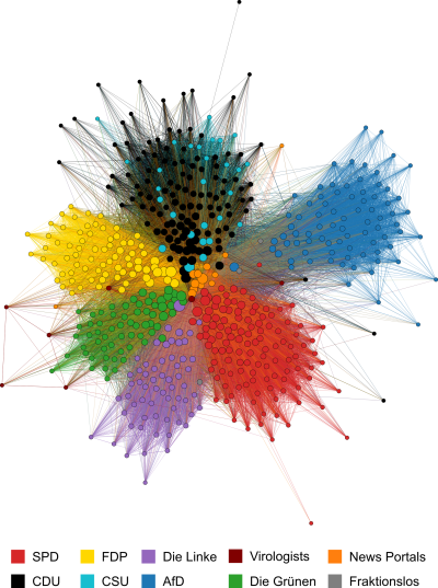
When creating a graph with all the mentioned types of nodes and edges based on all tweets in our dataset, it can be plotted using the Fruchterman-Reingold algorithm as the following network.
What can be seen here is that politicians are grouped mostly according to their parties, or party-group in case of the sister-parties CDU and CSU. Nodes representing news portals are mostly located at the center of the graph, while nodes representing virologists are sprinkled throughout. Although the grouping of nodes according to their affiliation can be clearly seen from the colouring of the nodes, the presented graph is nonetheless rather dense, meaning there is no large differentiation between singular groups of nodes. The most notable distance of one component of the graph can be made out when looking at the blue nodes belonging to the right-wing AfD.
When creating the same graph, but based on either COVID- or non-COVID-tweets, the results are much the same. The most notable thing about the comparison of these two graphs is the slightly higher modularity (a measure for the separation of network components from each other) of the graph based on COVID-tweets, indicating a somewhat clearer division between the parties when dealing with COVID-19.
Community Detection
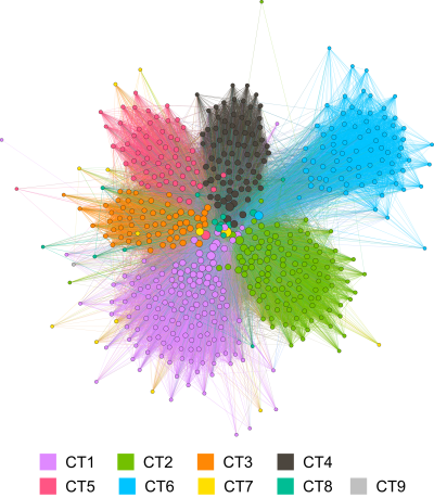
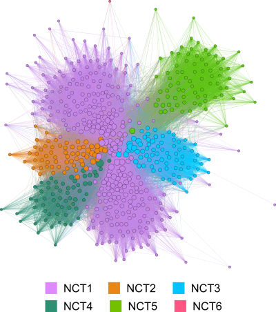
While some conclusion about the clustering of node can be drawn from looking at the first presented graphs, there are more ways to detect communities. The one we decided to use is community detection via the Infomap algorithm. The two resulting graphs based on COVID- and non-COVID-tweets repectively can be seen below.
The comparison shows that communities in the graph based on COVID-tweets are once again almost identical to the structure of the associations, but the communities in the graph based on non-COVID-tweets are bigger and more connected. Interestingly, the communities in the latter graph are very much a representation of the current political landscape in Germany. Parties currently in the opposition each have their own community, while the parties forming the government are grouped together in NCT1. The compartison between both graph further indicates that opinions of parties differ more when it comes to COVID-19 than when dealing with „normal“ everyday political issues.
Influential Twitter users
Influential users in a network graph can be identified by the number of incoming and outgoing edges. These numbers are called indegree and outdegree. Accounts with high indegrees are influential because they receive a lot of attention for their content. They are often called opinion leaders. Accounts with high indegress in our dataset are generally popular popular politicians with positions such as party leaders or federal ministers. Accounts with high outdegrees are influential because they are very active on Twitter, and therefore play a big role in distributing and curating content. They are often called superparticipants. Accounts belonging to the news portals category often have large outdegrees, because they generate lots of content.
Comparing the graphs based on COVID- and non-COVID-tweets repectively, it becomes apparent that the influential accounts are mostly the same in both graphs. Accounts related to health and science, like Karl Lauterbach or Jens Spahn, place slightly higher in the graph based on COVID-tweets, which is to be expected.
Looking at the additional acounts in our dataset, news portals and virologists, we can see that news portals often have high indegrees and even higher outdegrees. They place at the very center of all graphs presented here, which makes sense, because they are largely independent of political parties, and instead connect the individual politicians via their content. What is notable however, is the small number of connections accounts of the category virologists have to ther types of accounts in our dataset. This presents an opportunity for members of all associations to make a greater effort to increase the visibility of the virologists accounts and their messages, which are highly important during a pandemic.
Comparison of Twitter Metrics to COVID-related events
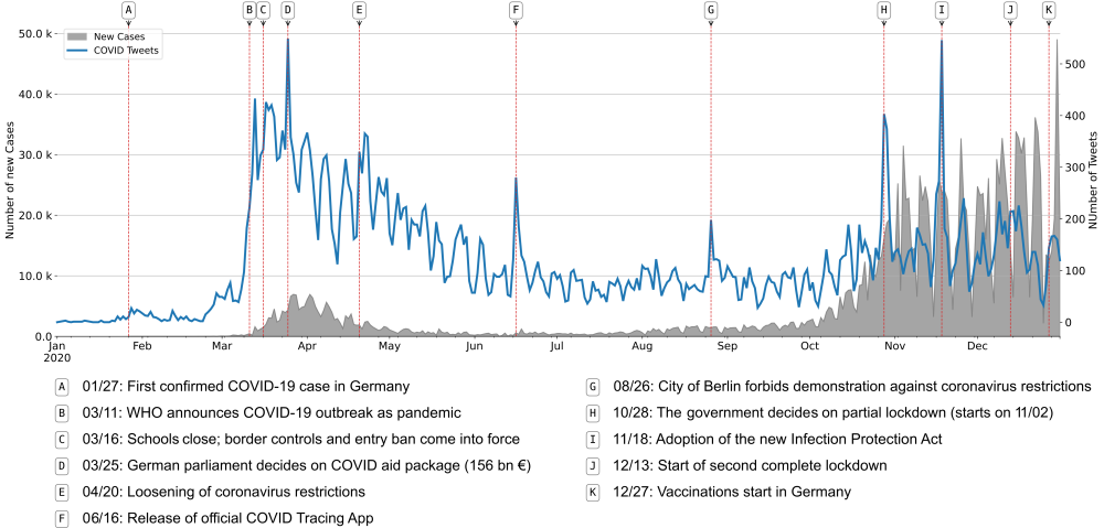
We compared the number of daily COVID-tweets by politicians in our datatset to the daily new infections in Germany throughout 2020. The visualization shows that the overall course of the pandemic and singular events related to it, like lockdowns or financial aid packages, can be tracked through the number of COVID-tweets on a given day. It is also notable that the reaction on Twitter during the intial outbreak of the pandemic in March was very strong, especially when compared to the end of the year, where the number of infections was much higher than during spring, but the number of tweets was relatevely low.

